Toledo
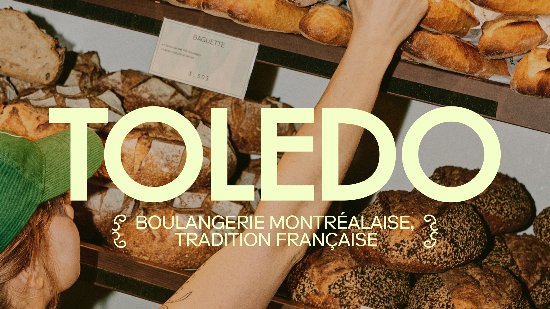
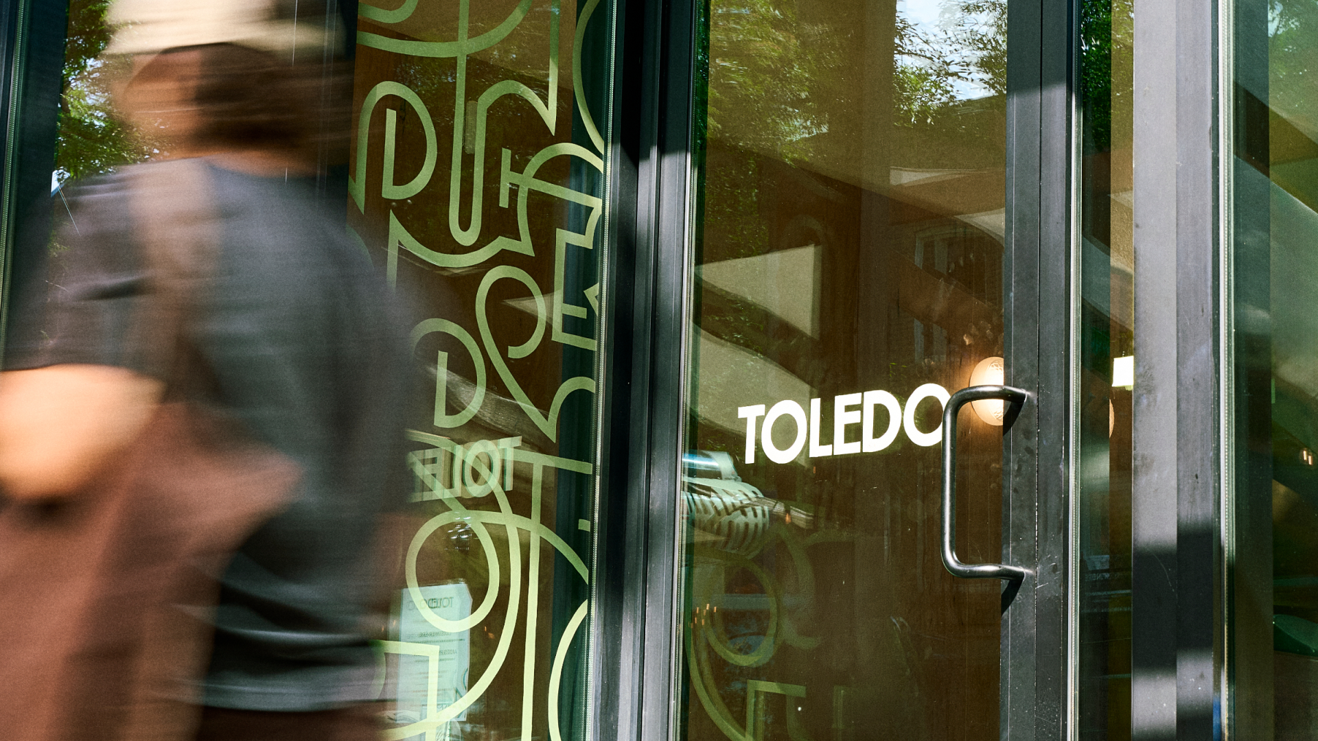
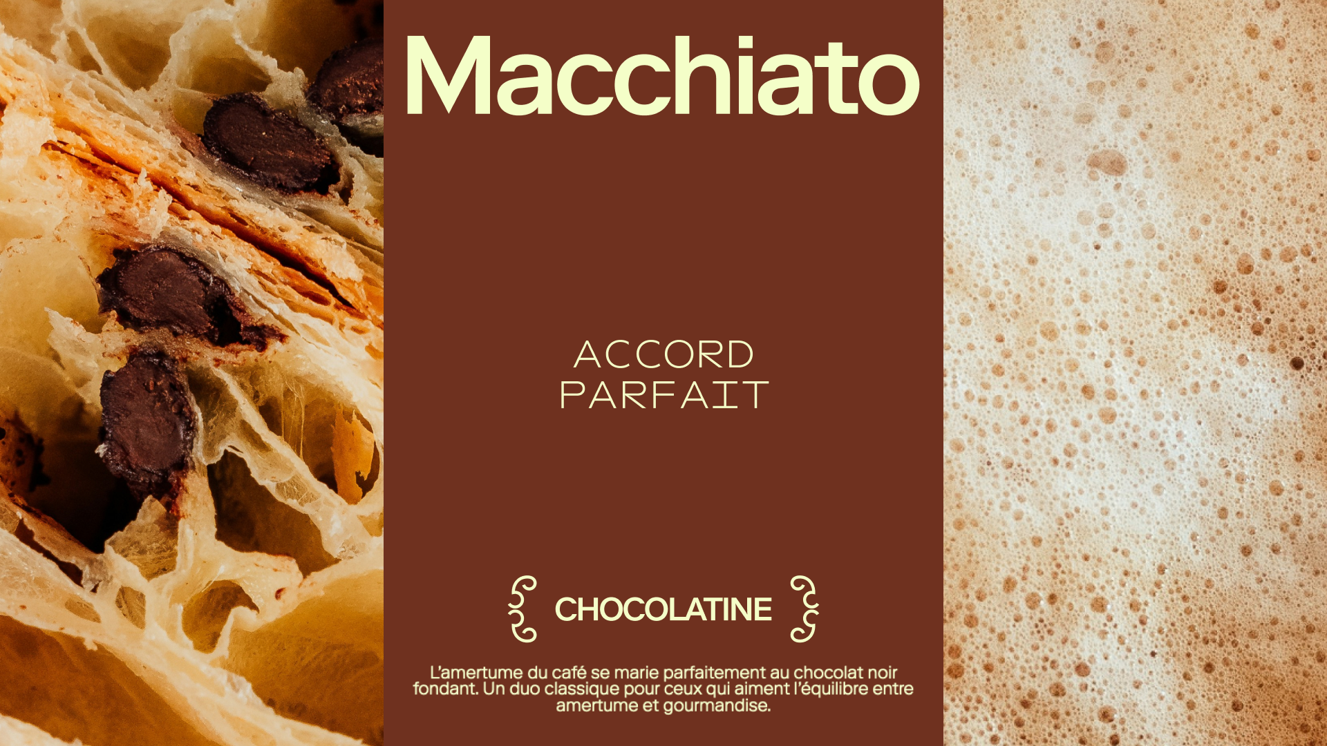
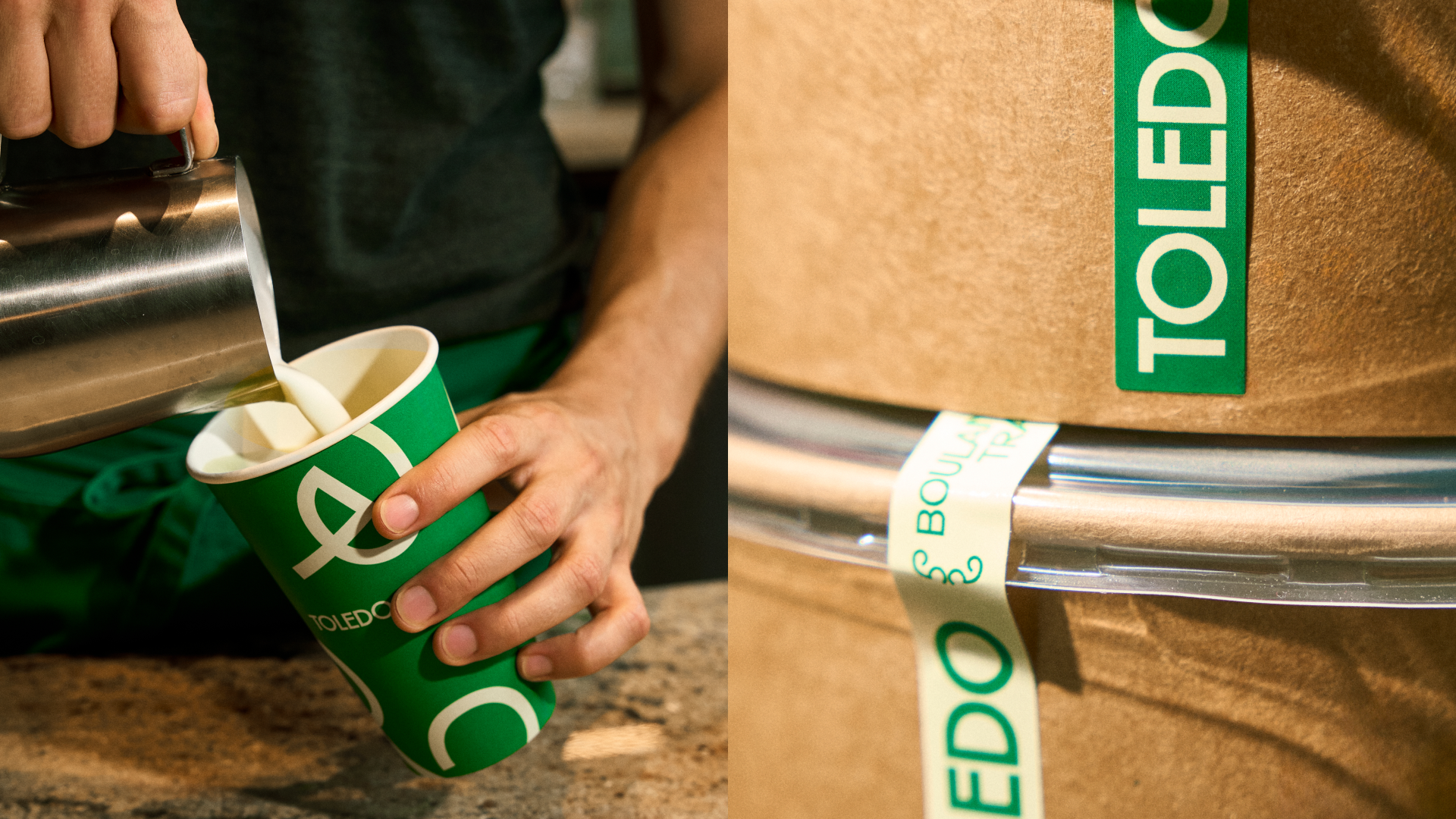
Since opening in 2019, Toledo has established itself as a must-visit destination in Montreal for artisanal bread, pastries, and specialty coffee. To mark the opening of its third location, the brand sought to evolve its identity to better reflect its growth while preserving the authenticity that fueled its success. The new graphic system draws inspiration from the irregular layers of puff pastry. These organic shapes create a flexible visual language that unfolds naturally across all brand touchpoints, from packaging and signage to interior design. The color palette celebrates the ingredients that define Toledo’s world: flour, butter, coffee, and fresh-baked bread. The brand’s iconic green is retained as a signature, ensuring continuity with its heritage while asserting this new identity. Combining ornamental details inspired by French baking craftsmanship with contemporary typography creates a balance between tradition and modernity. The result is a warm, distinctive, and scalable identity designed to support Toledo’s continued expansion and reinforce its status as a Montreal staple.
Visiter le site webCREATIVE DIRECTION - Justin Daoust
DESIGN - Samuel Lauzon
PROJECT MANAGEMENT - Arianne Thivierge
Voir le site